greenline

We designed a user-centric and visually impactful website for GreenLine, India's leading green logistics provider. The site effectively showcases their green logistics solutions, enhancing their brand image and driving business growth.

  • Market Research
  • Competitive Analysis
  • User Survey
  • User Flow
  • Wireframes
  • Colour, Typography & Grid
  • Accessibility Evaluation
  • High-fidelity UI
  • Prototype
WhereMumbai, India
WhatBrand Website
WhyReal World Project
RoleDesigner
CategorySustainability,
Logistics
When2024
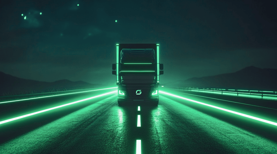
GreenLine hero illustration: LNG trucks on a highway with sustainability iconography

Market Research

The Problem

The brand's previous online presence failed to effectively:

Communicate its value proposition to B2B clients, emphasizing emission reductions from LNG trucks and its EV roadmap.

Establish thought leadership in sustainable logistics by showcasing innovation and client successes.

Optimize user experience for seamless navigation, lead generation, and engaging content.

The Approach

Create a website experience that showcases GreenLine's differentiation:

First-mover Advantage

GreenLine is the frontrunner in using LNG trucks in India, offering a unique and green mobility solution compared to traditional diesel fleets.

Pioneering Clean Logistics

GreenLine helps clients achieve significantly reduced Scope 3 emissions for clients, empowering them to decarbonize their supply chain.

Focus on Safety with ADAS

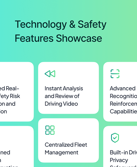
GreenLine trucks feature 6 ADAS cameras and AI technology for unparalleled safety, setting them apart from the competition.

Competitive Analysis

While GreenLine had no direct competitors in its category, it shared the market with brands offering similar business propositions. Key insights from these brands are outlined below:

Ryze Power

The Good

  • Clear Mission: Website effectively communicates Ryze Power's focus on clean hydrogen supply and infrastructure.
  • Informative Content: Provides valuable information on "Why Hydrogen," positioning Ryze Power as an industry leader.
  • Strategic Partnerships: Highlights collaborations with reputable partners to enhance credibility.

The Bad

  • Missing Storytelling: No customer success stories or impactful case studies to connect with users emotionally.
  • Limited Differentiation: No clear explanation of what sets Ryze Power apart from the competition.
  • Lack of Engaging Micro-interactions: Static website with limited animations, reducing user engagement.
Switch Mobility EV logo

Switch Mobility EV

The Good

  • Clear Product Focus: Website effectively showcases EV portfolio with clear navigation.
  • Quantifiable Impact: Highlights achievements with data (e.g., "1000+ Buses on Road").
  • Mobile-Friendly: Responsive design ensures a good user experience across devices.

The Bad

  • Focus on Features, not Benefits: Prioritize client benefits over technical specifications.
  • Content Hierarchy Issues: Some pages present information in a cluttered manner.
  • Lack of Interactive Elements: Limited use of videos, animations, etc. to engage users.
Element-2 logo

Element-2

The Good

  • Visually Appealing: Strong design and aesthetics create an engaging browsing experience.
  • Modern Interactions: Includes subtle animations and micro-interactions for a contemporary feel.
  • Responsive Design: Adapts seamlessly to various screen sizes for accessibility.

The Bad

  • Weak Hero Section: Hero section lacks impact; needs a stronger image or video.
  • Missing Emotional Connection: Lack of storytelling and customer success stories.
  • Unclear Target Audience: Website's language lacks specific audience targeting.

Stakeholder Survey

We conducted a Q&A session with stakeholders to understand brand challenges. Key insights are summarized below.

Which of these features are most important to you?

7 participants

Product Portfolio & Solutions23%
B2B Lead Generation21%
Sustainability Initiatives & Impact19%
Client Success Stories16%
Technology & Safety14%
Investor Info & Company News7%

Biggest Pain Points in previous website:

"Difficulty communicating LNG truck benefits to B2B clients."

"Need to highlight environmental impact alongside performance and efficiency."

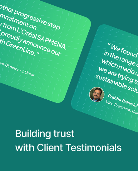
"Missing client testimonials that showcase the success of GreenLine's solutions."

Time to start designing

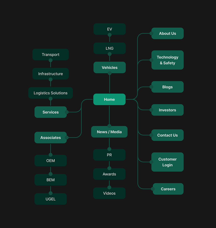
User flow diagram for the GreenLine website

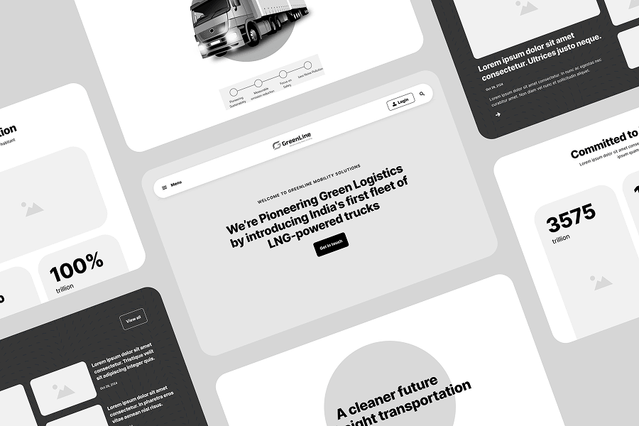
Wireframes

Low-fidelity wireframes for the GreenLine website

Colour Palette & Typography

To bring GreenLine's brand to life, we crafted a vibrant color system inspired by their guidelines. This system, featuring a custom gradient, adds a dynamic touch to titles and highlights throughout the website. We chose Plus Jakarta Sans as our primary typeface, ensuring optimal readability across all screens.

Colour Palette

Primary
Gradient
Success
Warning
Destructive

Typography

Plus Jakarta Sans

Aa  Bb  123

RegularSemiboldExtrabold

Website

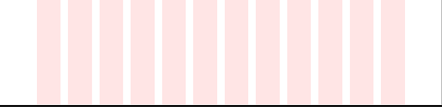
Grid parameters included an 8-point base unit, 12 columns, 120px margins, and 24px gutters.

Diagram of the 12-column, 8-point grid with 120px margins and a 24px gutter

Accessibility Check

The color palette adheres to WCAG AA contrast guidelines to ensure accessibility.

Light colour contrast sample

AA small text: Pass

AA large text: Pass

Dark colour contrast sample

AA small text: Pass

AA large text: Pass

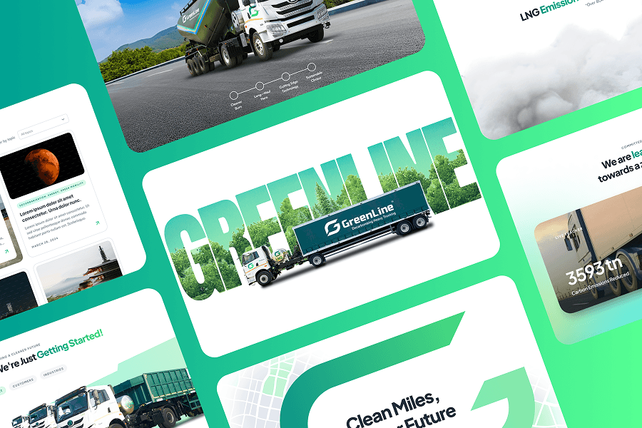
High Fidelity UI

High-fidelity UI screens for the GreenLine website

Features

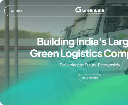
Strong First Impression

A powerful opening section combines a clear brand message, an engaging video, and vibrant brand colors for a visually stunning impact.

GreenLine website hero section mockup
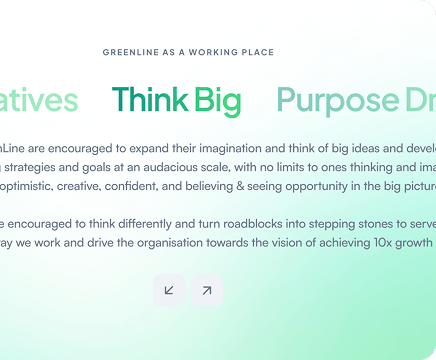
GreenLine website content section mockup

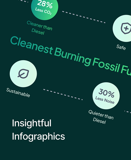
Making content great again

We made a conscious effort to break up information into smaller pieces of consumable content using typography and animations. This helped break up the monotony of text across the website, thereby improving user experience.

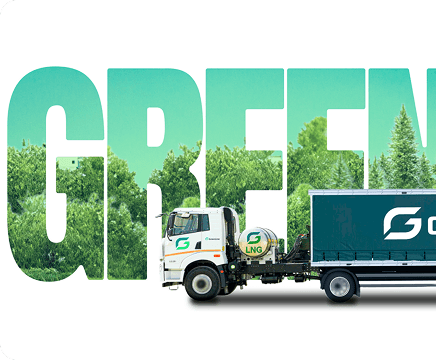
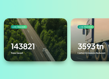
Delightful Animations

Micro-interactions and animations throughout the website enhance user engagement and create a more enjoyable browsing experience.

GreenLine website animation section mockup
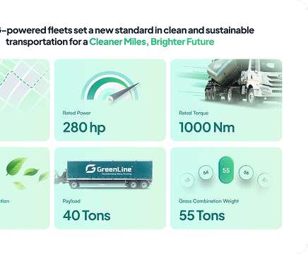
GreenLine website bento grid mockup

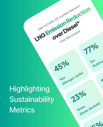
Incorporating Bento Grids

We prioritized showcasing GreenLine's products. 'Bento Grids' proved instrumental in presenting key features and data in a visually appealing and informative format.

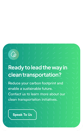
CTAs that convert

Strategic CTAs guide users throughout their website journey, driving higher lead generation rates for GreenLine.

GreenLine website call-to-action mockup

Designed with pixel perfect precision and detail

GreenLine design system component showcase, part one GreenLine design system component showcase, part two
GreenLine design system component showcase, part three GreenLine design system component showcase, part four GreenLine design system component showcase, part five