EET (essar energy transition)

EET is a low-carbon energy company leading innovation in hydrogen, sustainable fuels, and infrastructure. The goal was to create a cohesive ecosystem of websites for EET and its subdivisions, each tailored to specific audiences while maintaining a unified brand presence.

  • Market Research

  • Competitive Analysis

  • User Survey

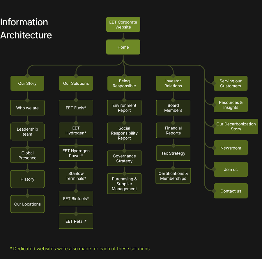
  • User Flow

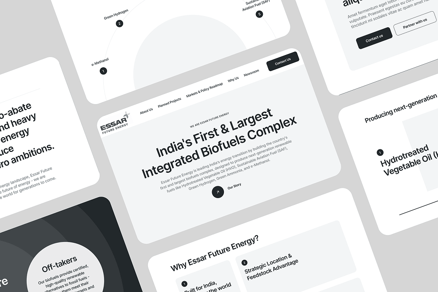
  • Wireframes

  • Colour, Typography & Grid

  • Accessibility Evaluation

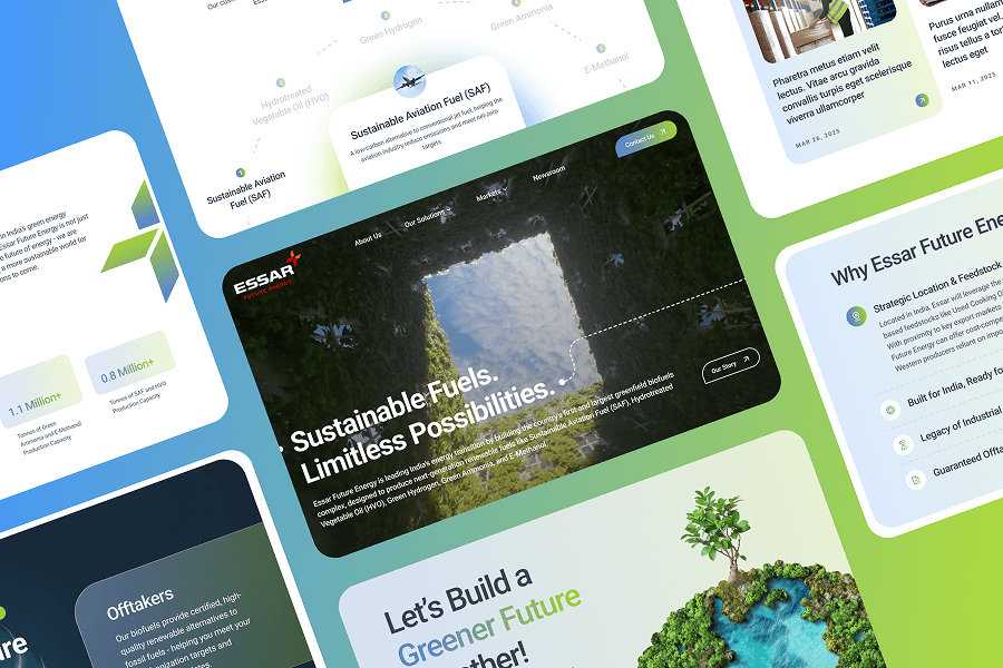
  • High-fidelity UI

  • Prototype

WhereMumbai, India
WhatBrand Website
WhyReal World Project
RoleDesign and Development
CategorySustainability, Energy
When2024
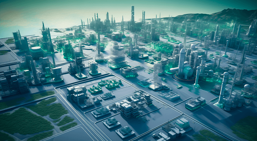
EET hero illustration: a futuristic zero-carbon industrial complex beside a winding road at dusk

Objectives

Launch a cohesive digital ecosystem to showcase EET's brand and mission.

Educate key audiences about their clean energy solutions - EET Fuels, Hydrogen, Biofuels, Carbon Capture, and Retail Ventures.

Build trust and credibility with stakeholders including:

  • Government & policymakers
  • Local authorities
  • Financiers
  • Industrial clients
  • Potential employees

Competitive Analysis

While GreenLine had no direct competitors in its category, it shared the market with brands offering similar business propositions. Key insights from these brands are outlined below:

BP

The Good

  • Employs a clean layout with a green and white color palette that aligns with its sustainability initiatives.
  • Features a well-structured information hierarchy, making it easy for users to find information.
  • Provides detailed reports, press releases, and sustainability initiatives, catering to stakeholders and investors.

The Bad

  • The use of visuals and micro-interactions could be enhanced to create a more engaging and immersive experience.
  • Some sections contain dense information that could benefit from collapsible content or more visual summaries to aid user comprehension.
  • Certain content sections may require better scaling to fit various mobile screen sizes.

Equinor

The Good

  • Features a minimalist design with a focus on clarity and simplicity, aligning with its commitment to innovation and sustainability.
  • Shares its energy transition plans and environmental commitments, building trust with stakeholders.
  • Adapts well to different screen sizes, providing a consistent experience across devices.

The Bad

  • Incorporating more narrative elements or case studies could make the content more relatable and engaging.
  • Could benefit from more narrative storytelling to connect with audiences on an emotional level.
  • Some text elements could benefit from higher contrast to improve readability.

Storegga

storegga.earth

The Good

  • The large, captivating hero visuals set a tone of clarity and innovation, reinforcing the environmental mission without overwhelming the content.
  • Refined animation effects such as smooth scroll-triggered transitions and subtle hover effects add a layer of sophistication.
  • Clear mission statement prominently featured on the homepage, making their purpose immediately evident

The Bad

  • No blog section for user education which is of key importance in this category,
  • Some sub-menu items are nested in a way that requires excessive tapping or scrolling, which can frustrate users on smaller screens.
  • There are areas where different sections cover similar topics (e.g., sustainability initiatives are scattered across several pages).

Stakeholder Survey

We conducted a Q&A session with EET's leadership team to understand brand challenges. Key insights are summarized below.

What are your primary objectives for this ecosystem of websites?

4 participants

43%

Position EET as a trusted partner and market leader in innovation-driven sustainability

31%

Communicate our solutions offering end-to-end decarbonization solutions

26%

Engage with potential customers, Govt. officials, businesses and strategic partners

Principal User Personas

Policy Advisor persona photo

Policy Advisor

A government stakeholder seeking clear, actionable data on EET's alignment with national carbon reduction goals and regulatory frameworks.

Industrial Procurement Lead persona photo

Industrial Procurement Lead

A decision-maker evaluating EET's hydrogen and fuel offerings for integration into large-scale manufacturing or logistics operations.

Institutional Investor persona photo

Institutional Investor

A capital allocator looking for scalable, credible, and financially sound low-carbon energy projects with long-term return potential.

Sustainability Consultant persona photo

Sustainability Consultant

An expert analyzing EET's impact metrics and innovations to recommend decarbonization pathways for clients and partners.

Technical Talent (Engineer/Operator) persona photo

Technical Talent (Engineer/Operator)

A skilled professional assessing EET's technological complexity, innovation potential, and site safety to consider future employment.

Time to start designing

User flow diagram for the EET website ecosystem

Wireframes

Low-fidelity wireframes for the EET website ecosystem

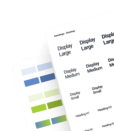
Colour Palette & Typography

To bring GreenLine's brand to life, we crafted a vibrant color system inspired by their guidelines. This system, featuring a custom gradient, adds a dynamic touch to titles and highlights throughout the website. We chose Plus Jakarta Sans as our primary typeface, ensuring optimal readability across all screens.

Colour Palette

Primary
Gradient
Success
Warning
Destructive

Typography

Roboto

Aa  Bb  123

RegularMediumBold

Website

Grid parameters included an 8-point base unit, 12 columns, 120px margins, and 24px gutters.

Grid overlay diagram strip

Accessibility Check

The color palette adheres to WCAG AA contrast guidelines to ensure accessibility.

Light colour contrast sample

AA small text: Pass

AA large text: Pass

Dark colour contrast sample

AA small text: Pass

AA large text: Pass

High Fidelity UI

High-fidelity UI screens for the EET website ecosystem

Features

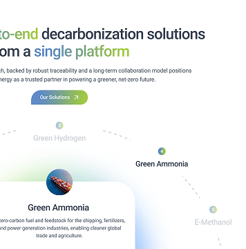
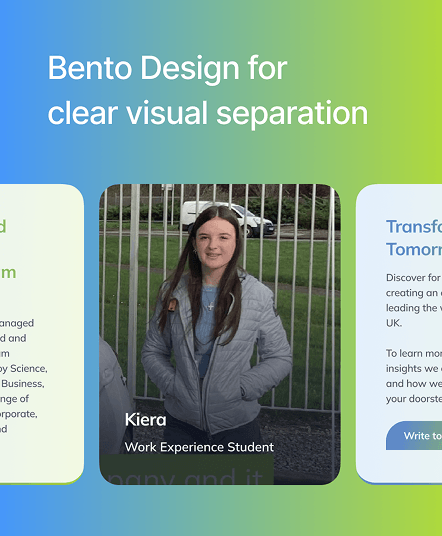
Impactful Hero Section

A powerful opening section combines a clear brand message, an engaging video, and vibrant brand colors for a visually stunning impact.

EET website hero section mockup
Interactive content section mockup

Interactive sections throughout the website

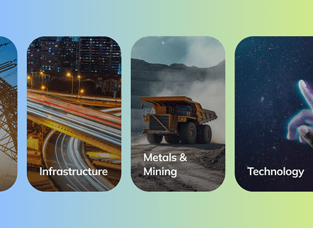
We made a conscious effort to break up information into smaller pieces of consumable content using typography and animations. This helped break up the monotony of text across the website, thereby improving user experience.

Scalable Micro-design System

Implementing atomic design principles through a custom micro-design system and components ensures scalability and versatility across the entire website ecosystem's lifespan.

Micro-design system component library
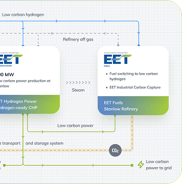
Custom animated infographic mockup

Custom Animated Infographics

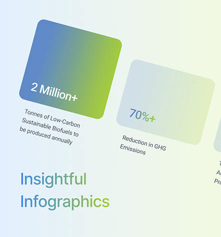
Custom animated infographics were designed and embedded across the websites to present EET's processes in a clear and digestible format.

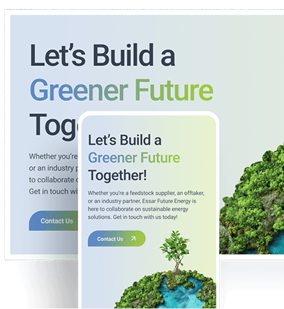
Cohesive User Experience

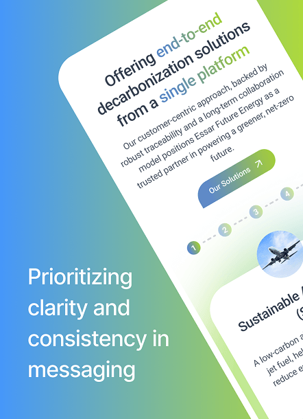
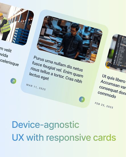
A key focus was delivering a cohesive user experience and brand identity, regardless of website or device. This required meticulous attention to detail and a shared understanding of the brand guidelines across the team.

Responsive layouts across devices

Designed with pixel perfect precision and detail

EET design system component showcase, part one EET design system component showcase, part two
EET design system component showcase, part three EET design system component showcase, part four EET design system component showcase, part five