chennai international airport

A fully integrated unified experience for Chennai International Airport, offering customers real-time information through a new website and app

WhereMumbai, India
WhatUnified Website &
Mobile App
WhyReal World Project
RoleDesigner
CategoryTravel
When2023
Chennai International Airport hero illustration of the city skyline at night

Market Research

The Problem

Chennai Airport lacked a cohesive digital experience for passengers, resulting in:

Fragmented Information

Passengers rely on multiple sources (website, app, social media) for flight information, leading to confusion and frustration.

Inconsistent User Experience

Discrepancies in functionality and design across platforms create a disjointed and confusing user journey.

Limited Real-time Information

Access to real-time updates on flight status, delays, gate changes, and airport amenities is inconsistent and often delayed.

Poor Accessibility

The current digital offerings may not be fully accessible to all users, including those with disabilities.

Missed Opportunities

The airport is missing opportunities to enhance passenger satisfaction and loyalty through personalized services and proactive communication.

The Solution

This unified app and web experience aims to:

Consolidate all passenger information into a single, user-friendly platform.

Create a seamless and consistent experience across all digital touchpoints.

Provide real-time, accurate, and easily accessible information to passengers.

Enhance accessibility and inclusivity for all users.

Leverage data to personalize the passenger experience and offer targeted services.

Competitive Analysis

As part of our comparative analysis, we researched the digital experiences of numerous airports, both domestically and internationally. Some notable examples are highlighted below.

BLR Airport app icon

BLR Airport

100K+ Downloads

The Good

  • Helps passengers navigate the airport efficiently, and locate amenities.
  • Offers online check-in and mobile boarding pass options.
  • Sends alerts for flight updates, delays, and other important information.

The Bad

  • Sometimes the real-time updates can be inaccurate or delayed.
  • Limited options for personalizing the app experience.
  • Occasional glitches, crashes, or slow loading times.
Changi App icon

Changi App

1M+ Downloads

The Good

  • Visually appealing and engaging, showcasing unique features and attractions.
  • Available in multiple languages, catering to a diverse audience.
  • Interactive maps with wayfinding tools to help passengers navigate.

The Bad

  • The sheer number of features and information might be overwhelming.
  • The search functionality isn't as robust as it could be.
  • The design might be perceived as cluttered for some users.
LHR London Heathrow Airport app icon

LHR London
Heathrow Airport

500K+ Downloads

The Good

  • Allows for convenient online check-in and the use of mobile boarding passes.
  • Provides information on parking options and allows advance parking booking.
  • Allows users to earn and redeem Heathrow Rewards points.
  • Enables passengers with special needs to easily request assistance.

The Bad

  • The airport misses opportunities to provide tailored recommendations to customers.
  • Users expect real-time, accurate flight information. Delays or inaccuracies can cause anxiety, frustration, and missed connections.
  • Frequent and irrelevant notifications can create a negative user experience.
Generic airport icon

Other Indian
Airports

The Good

  • Information on restaurants, shops, lounges, and other airport facilities is readily available.
  • Some websites facilitate requests for special assistance, such as wheelchair access or assistance with baggage.

The Bad

  • Lack of a dedicated mobile application relying solely on a website experience.
  • Passengers miss out on the convenience of interactive maps for navigating terminals and finding amenities.
  • Mobile boarding passes are unavailable, resulting in a time-consuming travel experience.

User Survey

To understand airport experience habits and challenges, we interviewed over 30 friends, family, and colleagues. Key insights are summarized below.

Which feature of an airport website/app is most important to you?

39 participants

Real-time Flight Info41%
Online Check-in27%
Interactive Maps20%
Airport Amenities12%

Biggest Pain Points in User Experience:

"Flight information was sometimes inaccurate."

"The app was a bit slow to load and not very intuitive."

"The maps were difficult and confusing to use."

Time to start designing

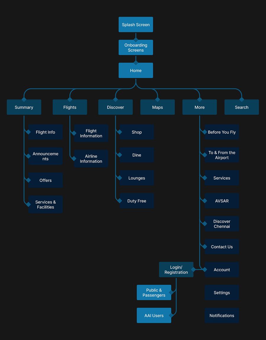
User flow diagram for the Chennai International Airport website and app

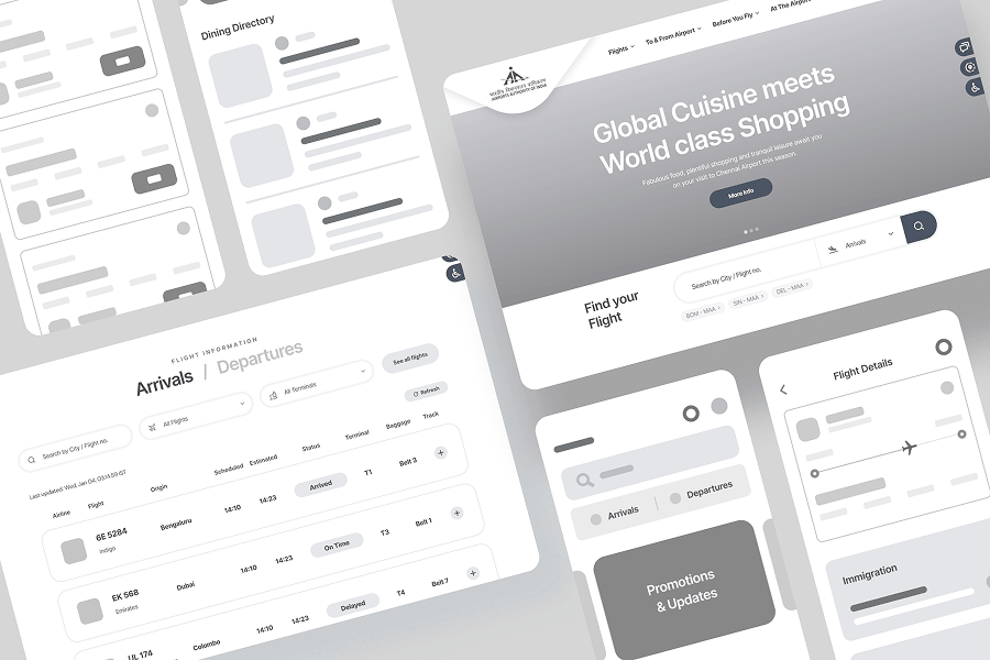
Wireframes

Low-fidelity wireframes for the Chennai International Airport website and app

Colour Palette & Typography

Having created a moodboard to understand the nuances of colour association with travel, the colour teal stood out as a common thread throughout the canvas. This made it the perfect choice for app branding. Product Sans was my typeface of choice due to its versatility and legibility at various sizes and weights

Colour Palette

Primary
Gradient
Success
Warning
Destructive

Typography

Satoshi

Aa Bb 123

RegularMediumBold

Grid & Spacing

Website

Grid parameters included an 8-point base unit, 12 columns, 120px margins, and 24px gutters.

Diagram of the 12-column, 8-point grid with 120px margins and a 24px gutter for the website

App

Grid parameters included an 8-point base unit, 4 columns, 16px margins, and 12px gutters.

Diagram of the 4-column, 8-point grid with 16px margins and a 12px gutter for the app

Accessibility Check

The color palette adheres to WCAG AA contrast guidelines to ensure accessibility.

Light colour contrast sample

AA small text: Pass

AA large text: Pass

Dark colour contrast sample

AA small text: Pass

AA large text: Pass

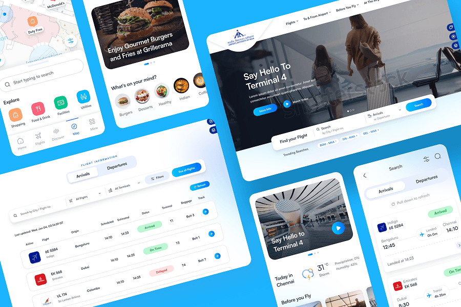
High Fidelity UI

High-fidelity UI screens for the Chennai International Airport website and app

Features

Unified website and app experience mockup

Unified Experience

The website and mobile app offer a unified user experience, ensuring feature parity and seamless accessibility across both platforms.

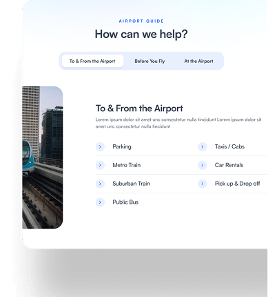
User-focused Structure

To improve user navigation, the experience is divided into intuitive sections:

  • To & From The Airport
  • Before You Fly
  • At The Airport

This makes it simpler for users to find the information they need

Airport website navigation structure mockup
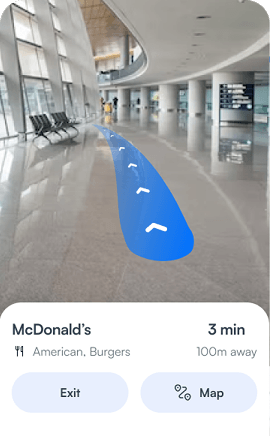
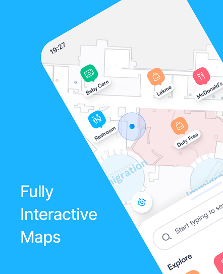
AR-guided interactive map mockup

More than just Interactive Maps

We went beyond traditional interactive maps by incorporating an innovative Bluetooth-guided real-time AR experience, offering a truly engaging and hassle-free airport navigation experience.

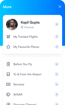
Personalized User Experience

User personalization was enhanced through the implementation of a login system, enabling users to save key information such as tracked flights and favorite places within the airport.

Personalized login and saved flights mockup
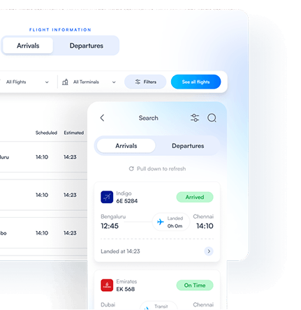
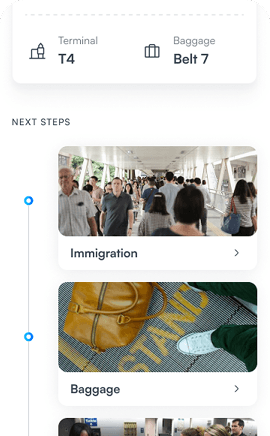
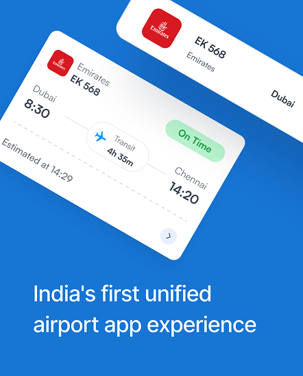
Flight tracking and guidance mockup

Beyond Flight Tracking

Real-time flight tracking is complemented by a dynamic user-guidance system that provides context-aware instructions and next steps for passengers throughout their arrival and departure experiences.

Designed with pixel perfect precision and detail

Chennai International Airport design system component showcase, part one Chennai International Airport design system component showcase, part two
Chennai International Airport design system component showcase, part three Chennai International Airport design system component showcase, part four Chennai International Airport design system component showcase, part five